Having served as a member of the editorial board for my university’s weekly newspaper, I’m quite familiar with the ins and outs of layout design.
Like any work-related experience, there’s a long list of things you should probably never even think about doing. Included on this list is what’s known as tombstoning. This is when two headlines or stories cross paths in a way that gives new meaning to whatever it is the stories were about. Essentially, they’re editing mishaps.
With tight deadlines, sometimes things just slip through the cracks. While no publication is without its fair share of mistakes, these 25 layout fails take the cake.
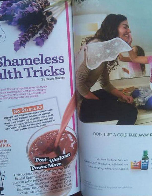
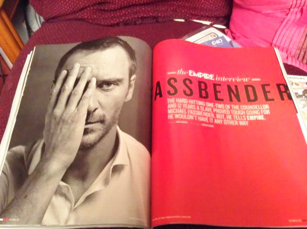
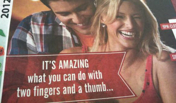
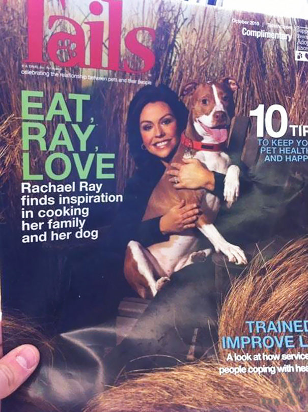
1. They can’t take their eyes away from the “real” you.
2. Does anyone check their layout before going to print?
3. This is wrong on so many levels.
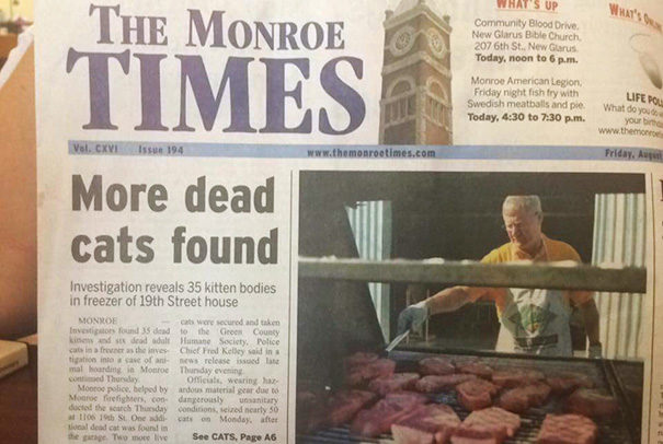
4. I suddenly lost my appetite.
5. I bet they sent in the dog catcher to capture him.
6. Someone must have been a bit desperate for honey.
7. Disclaimer: Not all “paedophiles” are big and hairy.
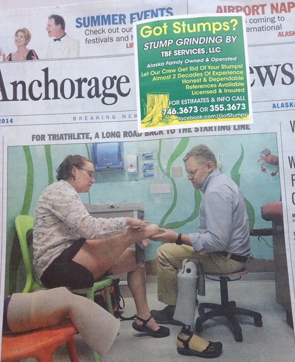
8. I’m stumped as to why anyone thought this was okay.
9. This calls for a celebration!
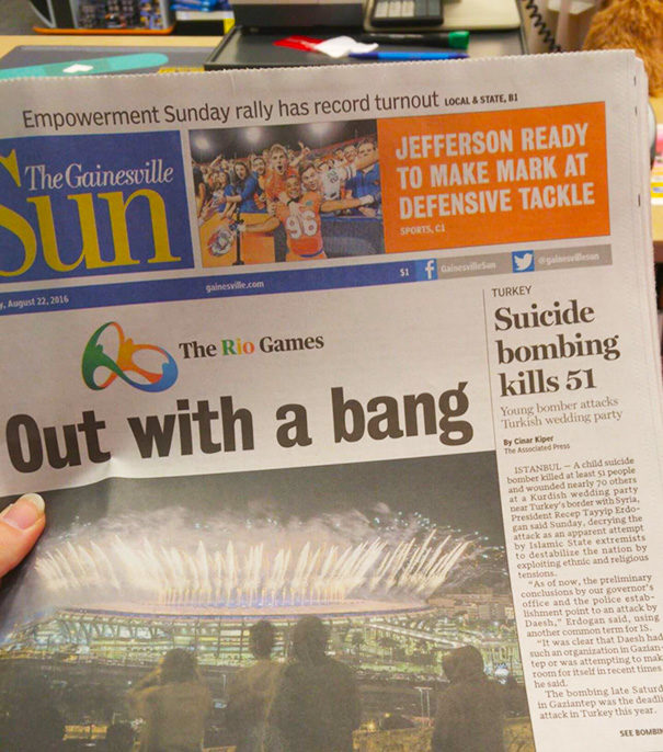
10. Was this layout fail a coincidence, or does someone have a sick sense of humor?
11. I’m honestly just amazed she can aim.
12. What you do in your private time probably shouldn’t be pasted all over magazines, George.
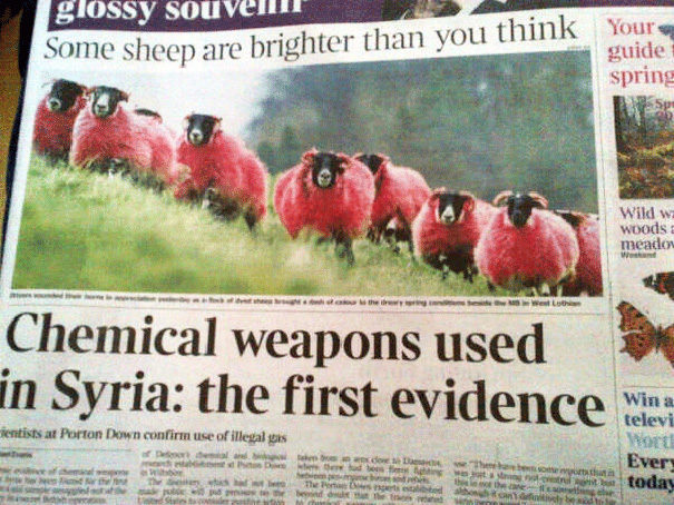
13. No sheep were harmed as a result of their chemical testing.
14. I always new there was something sketchy about Garth Brooks.
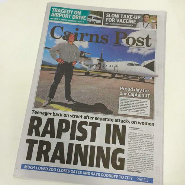
15. That’s a very proud stance for a known criminal.
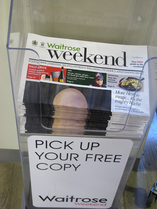
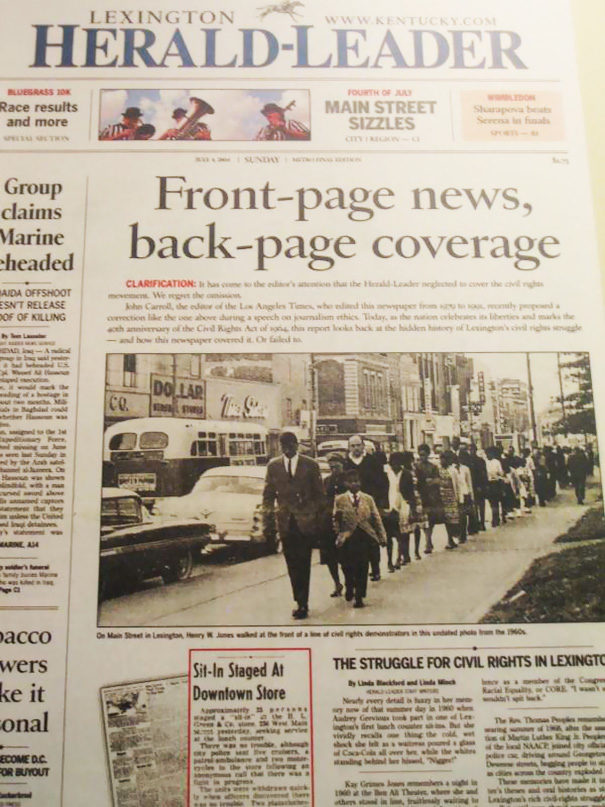
16. This is why you avoid putting bald men on the front page of a newspaper.
17. They’re talking about bowling, people. Get your minds out of the gutter.
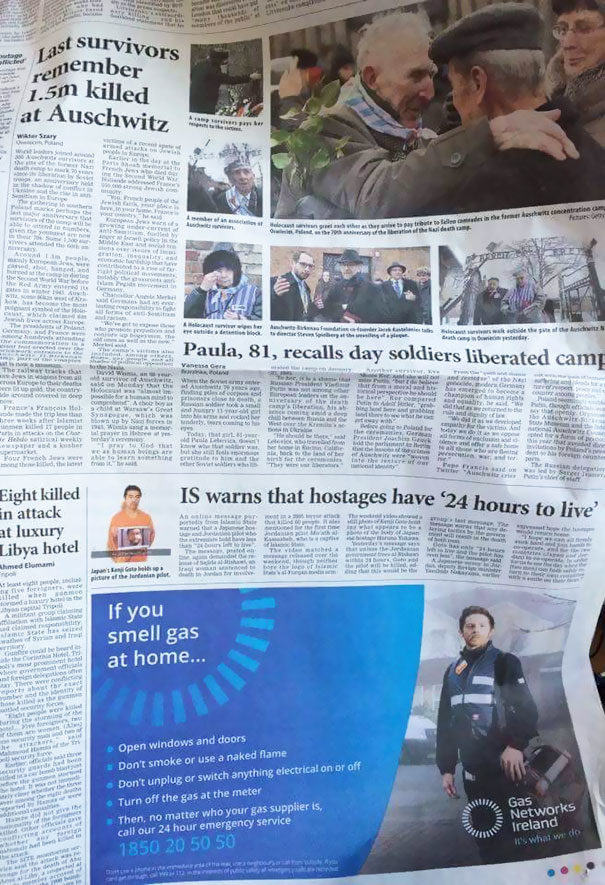
18. If they couldn’t remember before, that gas add isn’t going to let them forget.
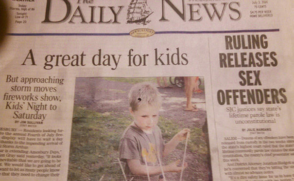
19. “Great” might not have been the word you were looking for.
20. Sometimes, you just have to point out the obvious.
21. Well, we know what was on this designer’s mind during the making of this ad.
22. He doesn’t look “at risk” to me.
23. Cannibalism: the real reason commas were invented.
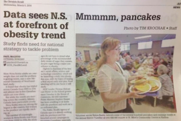
24. Pancakes are the root of all evil.
25. I’d be covering my face if I’d sent this to print.
Now, I’m not saying my paper’s editorial team was perfect, but I can assure you that most of these would never have been published. Let’s just chalk these up to epic, isolated failures.












Comments